

“Painting Small and Often” Collection, Acrylic on Stretched Canvas, 9” x 12”

“Painting Small and Often”, a collection of 7 acrylic studies on stretched canvas, 9” x 12”
I’m not going to lie. I don’t paint everyday. Being a single mom with a full time job I find it almost impossible to do so. This always leaves me feeling guilty that I am not prioritizing my art practice but it also leaves me with a feeling of trepidation whenever I approach large and even small canvasses wanting to make my limited painting time as productive as possible. I found myself approaching even my sketchbooks with a feeling of anxiety as the curse of perfectionism takes hold of me (read my blog post about letting go of perfectionism in my sketchbook practice here). Therefore, I end up in the preparation and research phase for days even weeks before I actually start a painting. Or I end up spending way too much time on a painting, most likely overworking it to death. I was in one of those stagnant phases when I came across Carol Marine’s book “Daily Painting: Paint Small and Often to Become a More Creative, Productive and Successful Artist”. It was exactly what I needed, as I was starting to feel frustrated with a botanical painting I’ve been reworking over and over. I wanted to break out of the rut and dive into more dynamic, expressive work full of quick, energetic and textured brushstrokes, which is my favorite way to paint. In the book, Carol Marine talks about a period in her life when she avoided painting because of the perfectionist curse and as a result, had a very clean house for many years (due to doing practically anything else including housework in order to avoid painting). She then decided to start painting small and on a daily basis, letting go of the need to be perfect or produce completely finished pieces. Over time, this daily painting practice taught her to accept the imperfections and mistakes, which eventually turned into valuable lessons that she incorporated into subsequent paintings. She grew her body of work that became a collection of mini paintings that she later offered up for sale in her blog Daily Paintworks where other artists could also display their daily paintings and sell them.
So I went out and bought a pack of of 9” x 12” stretched canvasses (7 in total) in order to try Carol Marine’s daily painting practice. I had tried this practice before last year when I was working on my “Ordinary Days” collection, where I created mini paintings on 10” x 10” canvasses with water mixable oils and focused on still life compositions (literally objects around my house). The paintings were done in the span of a few hours as I wanted to avoid reworking any mistakes done in oils. For the most part, I’m very proud of that collection, but more importantly, I thoroughly enjoyed the process, simply because I didn’t belabor every little detail and allowed the paintings to be what they were: mistakes and all. This time around, however, was different. All the paintings were done in acrylic, there was no unified theme in terms of subject matter or composition or color palette. The subjects ran the gamut from still life to disco balls to botanicals. I tried to keep the paintings to a day, maximum 2 (with the initial sketch and underpainting done on the first day and the main painting and final details done on the second day), but there were a couple that took me 3 days before I finally let them be. Some paintings were obviously less challenging than others.
1- Still Life with Peaches, Acrylic on Stretched Canvas, 9” x 12”

“Still Life with Peaches”, acrylic on stretched canvas, 9” x 12”
I’ve been recently finishing up Katie Jobling’s course “Learn to Paint with Confidence”. One of the color theory exercises she had us do is create a color chart to match the color schemes of different objects, one of which was a peach. The idea was to use complementary colors in varying degrees to approach as close as possible the different hues and values in the original object. I wanted to do a slightly larger study of the peach in order to test my knowledge of this color theory exercise. I used a royalty free reference image from Dreamstime Images by Martateron (Still life with nectarines stock image. Image of yellow - 110570997 (dreamstime.com). I did the initial sketch and underpainting the first day and then finished it off the next day. I incorporated the color theory knowledge I had just acquired keeping in mind to use complementary colors to add depth to the peaches. I was very happy with the color scheme but also the texture on the peaches and the dark atmospheric background.
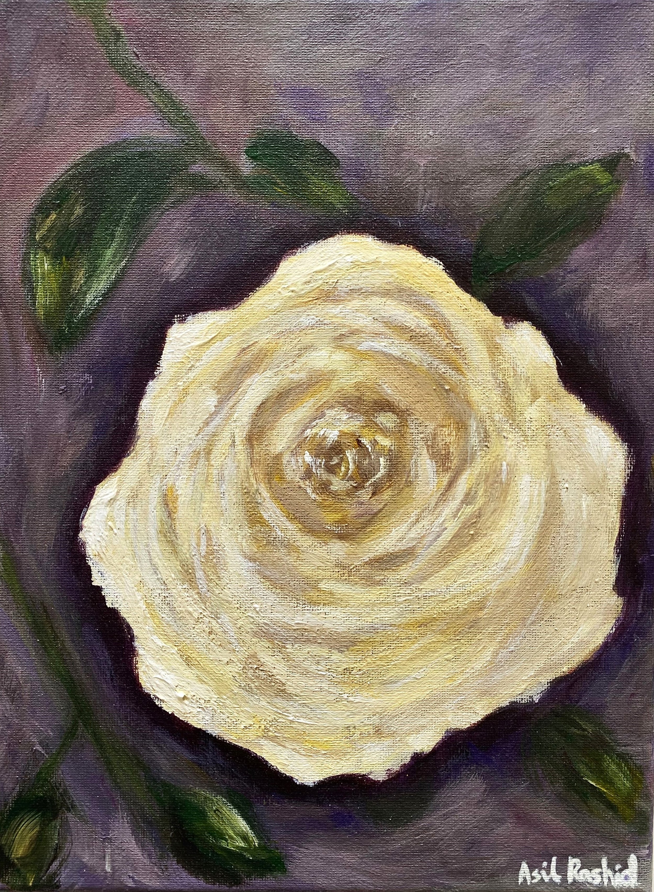
“White Rose”, acrylic on stretched cnavas, 9”x12”
Continuing with color theory, I decided to paint the deceptive white rose, based on one of Katie Jobling’s tutorials where she shows that white roses are actually anything but white, but rather different values of yellows and ever so faint touches of purple for the shadows, with white being the main highlight. This was a useful exercise as it showed me how a bright color like cadmium yellow could be dulled down and given more dimension with a tiny bit of violet (its complementary color) and how it works well as a shadow color as well.
3- Coleus Plant on Blue, Acrylic on Stretched Canvas, 9” x 12”

“Coleus on Blue”, acrylic on stretched canvas, 9”x12”
This has, by far, been the most challenging painting of the collection. I decided to paint my coleus plant, seeing as I felt I needed more practice in painting botanicals. I had previously struggled with a larger botanical painting of my monstera plant and decided to keep practicing, and maybe end up with a collection of paintings of my houseplants. I initially used a reference image and then had to paint over it and start again. The second time around, I decided not to be precious but to make it as impressionistic as possible and borderline abstract. I honestly did not enjoy this process or the finished result, but as I had already spend more than 2 days on it, I decided to call it done. The most challenging part of the painting was trying to portray the overlapping foliage and the shadows in between them while also defining the edges of each one so that they don’t all blend together into a big blob. I then played around with the background before I settled on a combination of ultramarine blue and white.

“Disco Ball”, acrylic on stretched canvas, 9”x12”
I had much easier go of it with my fourth painting than I did the one before. I have been recently following a contemporary artist Sari Shryack from Not Sorry Art, whose style of painting is the perfect blend of high chroma color palette and impressionist brushstrokes with a hint of realism. Her portraits are especially beautiful. She is most known for her disco balls collection and since I had such a difficult time with my previous painting I decided to paint something relatively simple in composition like a disco ball. I used a small disco ball that my daughter had as a reference. However, disco balls are colorless and often reflect the color of the space they are in. I wanted mine to reflect happy bright colors of purple, pink and yellows. The composition and shape was pretty simple. The main work went into figuring out color placement and which tiles I wanted to reflect light the most. The process was enjoyable for the most part and meditative as there wasn’t much decision making and forethought involved.

“Pear in Blue”, acrylic on stretched canvas, 9”x12”
By my fifth painting, I was starting to find my stride. I decided for this one I wanted to create a tonal study where I could explore different values of the same color. In my mother’s old apartment, there was a mini painting, given to her as a gift, of a single pear painted entirely with blue. The painting was a monochromatic tonal study, where different values of the same blue color were used to signify areas of shadows, mid tones and light. I’ve always admired the painting for its deceptive simplicity and wanted to do a similar tonal study. I chose different combinations of ultramarine blue and cyan blue for the background, and phthalocyanine blue for the pear. The varying degrees of blue gave the whole painting a moody atmosphere and perhaps made it a tad too dark but in the end I was quite happy with the result.

“Still Life with Tomatoes”, acrylic on stretched canvas, 9”x12”
For my sixth painting, I wanted to explore the use of complementary colors for the background. I chose a reference image (a photograph) of Alai Ganuza (www.alaiganuza.com), of a still life of tomatoes. I originally wanted to do a teal background and then changed it to a light pink background which I felt contrasted better with the red of the tomatoes. I like the gradation effect of shadows, midtones and highlights on the tomatoes, using gestural, flat brushstrokes and the shadows they cast around them. I tried not to be too precious with the details of the halved tomatoes especially and left certain elements unfinished. But overall, it has a much more pleasing aesthetic than if they were overworked.

“Conch Shell Study”, acrylic on stretched canvas, 9”x12”
This is , by far, my favorite painting in the collection, and the one that took the shortest amount of time to complete (barely a day and a half) and was the most enjoyable to paint. At first, I was apprehensive about painting such a complicated shape like a conch shell with swirls and dips and crevices which would surely prove challenging to render. But once I got the proportions down, I simplified the dips and crevices to shapes and areas of dark and light. I wanted the shell to be almost luminous and so I used gold paint in some places. It turned out very well, and I let the mistakes be what they are without being too precious about it and resisting the temptation to go back in and overwork them. As a result, it turned out to be the painting that I am the most proud of in the entire collection.
All in all, even though there were challenging moments during the creation of this collection, and I feel like I need to do more of these quick mini paintings in order to cure myself of being too precious with paintings, I did enjoy the process (with the exception of painting #3) as I learnt valuable lessons, not least of which being mindful of color theory and using complementary colors to add a sense of realism and depth to a painting. But I also learnt that when I paint quickly (as I did with my Ordinary Days collection) I avoid overworking the piece and I enjoy the process a lot more. It’s all about breaking down the elements in the composition to simple shapes and areas of light and dark. The quick gestural brushtrokes also give the painting a more textured dynamic vibe of energy and movement.
All paintings available in my shop.